

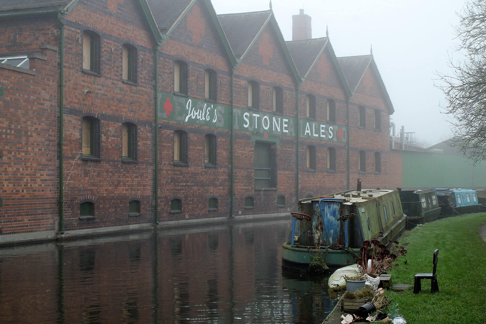
A debate raged online this week when a member of the A Little Bit of Stone—Your Photos Facebook group shared images of MGS Precision’s recently refurbished canal-side facade.
Here’s the newly repainted sign:

The restoration work has ignited passionate discussion among Stone residents about heritage preservation and craftsmanship.
Many locals expressed dismay at the execution of the work. “Why change history – the sign was already there, just follow it, repaint it,” argued one resident, reflecting a common sentiment that the original signage should have simply been refreshed. “It would have been cheaper to do it right,” they added.
The unusual appearance of the double signage led some to question whether the images were authentic. “Surely this is photographic mischief,” wondered one commenter, while another asked if it had been created using an app. However, photographer Richard Burrows quickly confirmed the reality of the work: “It is real, no computer or camera tricks.”
However, defenders of the project argue that the approach actually preserves multiple layers of the building’s history. “The poor guys can’t win: they’ve restored the 50 year old ‘Joule’s’ sign and respected the 100+ year old ‘STONE ALE STORES’ sign. Which sign would people prefer them to have destroyed?” asked one supporter.
The historical significance of the original work was highlighted by those familiar with its past, with one commenter noting it was “originally painted by John Durham and years later given a facelift by tracing over the original letters.”

Some residents have raised concerns about potential official oversight, suggesting “it might not fly with planning conservation.” This has led to calls for the Conservation Officer to become involved.
Here’s how the signs looked in recent years before the work.
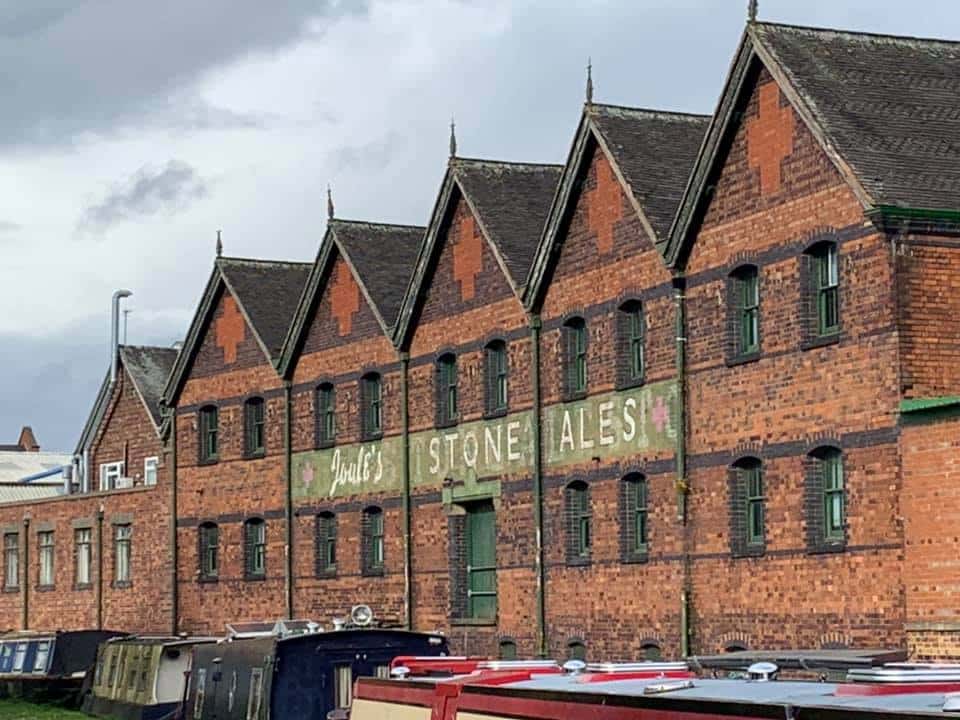
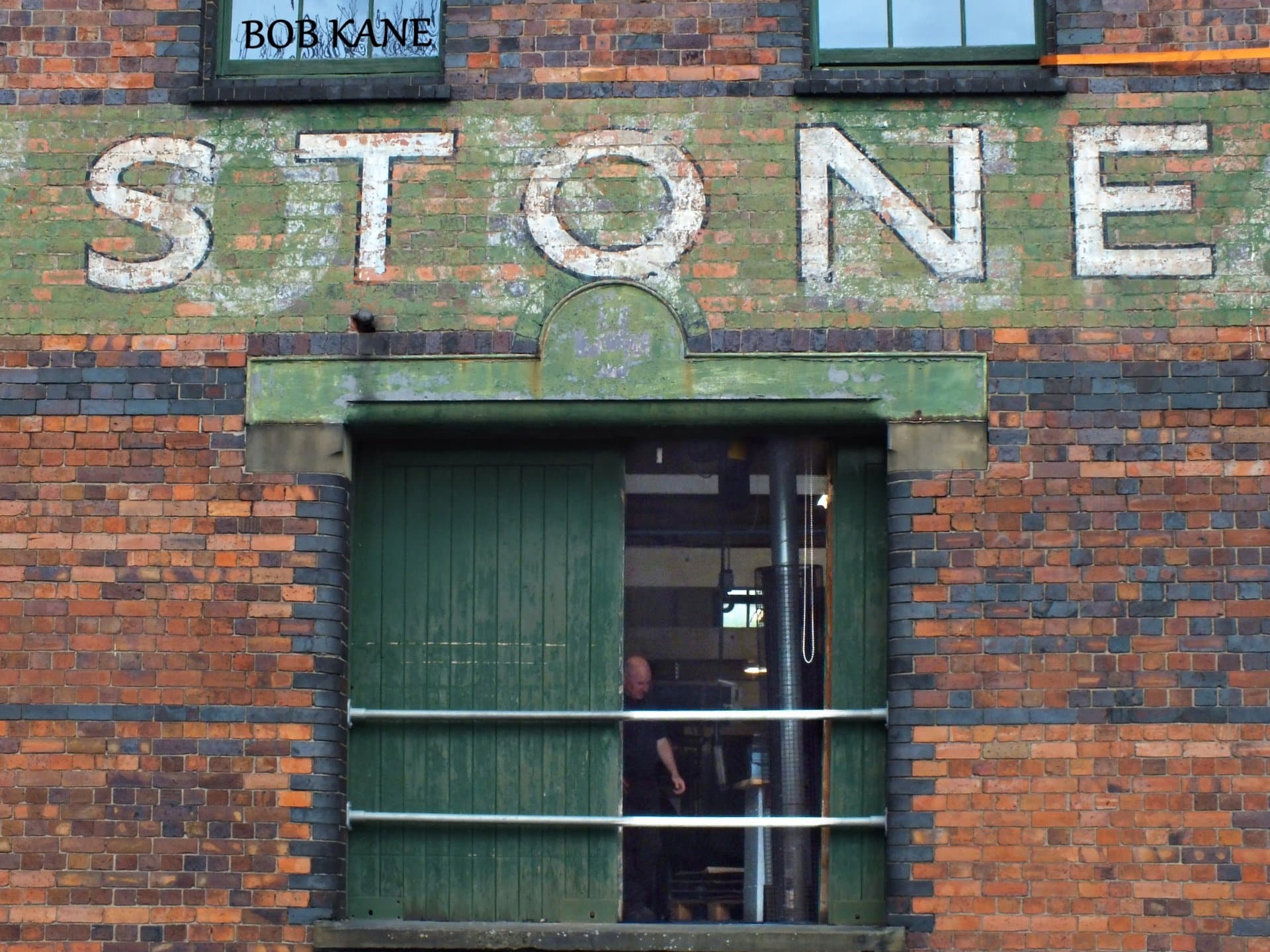
The freshly painted sign looks crisp compared to how it previously looked, so will it settle over time? You can see from the close-ups the work gone into restoring the original-original sign with muted whites.
What are your thoughts?
The refurbishment was carried out by the landlord and Croft Building and Conservation Ltd – MGS Precision are just a tenant and had no input into the works carried out. When we get a further update from those involved, we will update further.


1 comment
Roger Durham
When my father painted the Joules Stone Ales sign in 1960 it also displayed the brewery’s famous red cross trademark logo at each end of the lettering and was on a green background which obscured the original bottle stores lettering.
The Sentinel newspaper ran a feature in 1992 on the first restoration of the fading signage by Craig Bostock a local narrowboat artist who was undertaking the task. My dad gave his reminiscences of how his ladders were perched on a derelict barge which gave him a few frights when passing craft created a backwash.